Lions and friends…
As you know, I created the MMRI as a real time market risk indicator, in that, it works. Ever since I published the MMRI, several people have made some eye opening observations… here is one below.
This is an observation of the MMRI which was made by FHIX28. This is very interesting! Have a look.
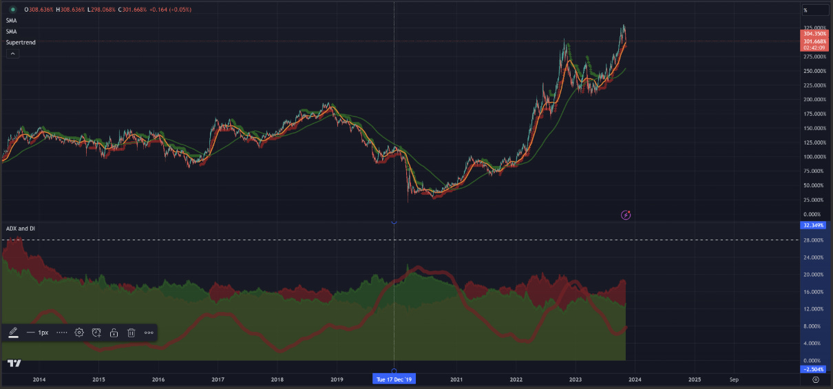
What you are looking at here is the MMRI's ADX and DI indicator, set at 200 with a threshold at 28. The green shaded area is DI- (to indicate that when the MMRI falls it is stock market positive) and the red shaded area is DI+ (to indicate that when the MMRI rises it is stock market negative). The red line is ADX 200.
The first thing to note is that around December 2019, this marked the first time that the ADX (red line) crossed both the red and green shaded areas (DI+ and DI-). There was no other time that this occurred, while backtesting.
Three months later, the U.S. went into lockdowns as a result of the Pandemic. To me, this is proof that the Federal Reserve printed too much money too fast, and it was going to break the system. They used the Pandemic to cover this up.
Moving forward to today, around November of 2022, the ADX crossed DI+ and DI- again. This was around the time that banks were beginning to fail due to lack of liquidity.
Based on this observation, the system broke apart in 2019 when the FED was printing too much too fast. This was the first signal that the system was beginning to fall apart. The second time the ADX crossed the DI indicators gives evidence to suggest that the FED can't suppress the MMRI anymore.
More notation in the screen capture below:
Fed's version of the Hunger Games....buy 10yrs when they are being shorted too much and sell them after people cover their shorts...the buying also allows the Friends of the Fed to lessen their losses and dump their 10 yrs when the Fed is buying them.
I'll be honest Gregory, I'm struggling to understand what your telling me here.