


Stock Market Trend. SP500
From Greg M

Lions and friends…
Have a look at this chart below.
This is the SP500 index over the last 3 months.
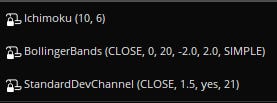
These are the settings I used.

As you can see, the trend is up. Most recently we touched the upper Bollinger band which is generally a signal that a pullback may occur- nothing dramatic. Both the upper and lower white lines represent standard deviation, and we are near the middle.
Looking at this, it does appear that
1. The trend remains higher, and
2. We may experience a slight pullback which would be expected after the recent run up.
In my opinion, a mild pullback here would be bullish.
I would LOVE to hear from you chartists out here!
GM
for charts I love this site https://stockcharts.com/h-sc/ui yes it looks like we got something bad coming. please democrats how is your vote a good thing?
You don’t believe in market fundamentals because there is no price discovery due to market manipulation. But you do believe in technical analysis because…