
Tracking Movement Of The MMRI.
From Greg M

Lions and friends…
If you track the MMRI to help you gauge market risk, this may be interesting to you.
This work was sent to me by FHIX28 and is definitely worth looking at.
Thank you FHIX28! He gives a full explanation on what he is looking at below the chart.
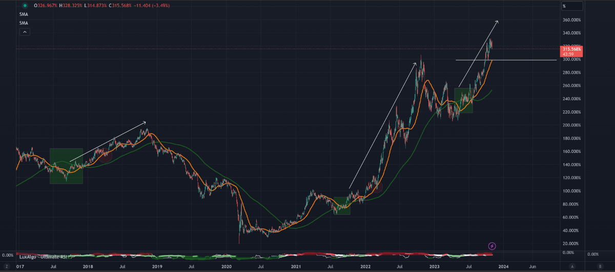
The Orange line is the 50 SMA, the Green line is the 200 SMA. The trend shows much more upside f…
Keep reading with a 7-day free trial
Subscribe to Gregory’s Newsletter to keep reading this post and get 7 days of free access to the full post archives.